Monday, March 11, 2013
artists statement
As a photographer, it is safe to say i am geared towards the stranger things in life. For this shoot I decided to take a trip down the rave scene, to see if I could find any similarities through out any other subcultures. most of my photos are painting with light as well as portraiture. i use strange angles,flash, low shutter speeeds,and a high iso to get my desired look.

Monday, March 4, 2013
For my final project, I decided to approach the genre, "nudity". However, as most know, nudity is often seen glorifying the female body. For this assignment, I would like to take a different approach and glorify the male body from a feminine aspect. In terms of "glorifying", I want the models to be totally unedited (no post production) with really soft lighting, and only have the bodies exposed. I plan on having about three models or so and possibly doing a human form using all three people. The reason I chose nudity was because nudity means unashamed, unlike naked which means ashamed. Therefore, with the feminine approach I will be taking on the male body, I should have an interest final product.
During this project, I want to incorporate photos using both studio, and natural lighting. Lighting is essential to bringing out the beauty of the human body, making sure your family of angles are accurately placed to capture all the curves, wrinkles, and even scars. As I said, I want these pictures to be convey a raw sense of beauty and feminism, while focusing on the male body.
One artist who's work really inspired me on this project is Mick Waghorne. He did a series of nude photographs (primarily woman) and I just feel his using of lighting and placement really brought out the beauty of these human forms. Another thing I liked about his work was he too used both studio and natural lighting which has completely different effects on the overall composition. http://mickwaghorne.darkfolio.com/gallery/145249#14
Below are three images I took doing the wordplay assignment which initially inspired me to further this subject matter on my final project.


During this project, I want to incorporate photos using both studio, and natural lighting. Lighting is essential to bringing out the beauty of the human body, making sure your family of angles are accurately placed to capture all the curves, wrinkles, and even scars. As I said, I want these pictures to be convey a raw sense of beauty and feminism, while focusing on the male body.
One artist who's work really inspired me on this project is Mick Waghorne. He did a series of nude photographs (primarily woman) and I just feel his using of lighting and placement really brought out the beauty of these human forms. Another thing I liked about his work was he too used both studio and natural lighting which has completely different effects on the overall composition. http://mickwaghorne.darkfolio.com/gallery/145249#14
Below are three images I took doing the wordplay assignment which initially inspired me to further this subject matter on my final project.


Final Project: Riley Clauser
For my final project I would like to convey sense of place through out the day and night of the northern Columbia River through reflections in the water. I would like to set the pictures up with the serene human free atmosphere with the human element or change shown in the reflection of the water. Ansel Adams has lots of "at the water's edge" photographs that I will draw inspiration from however I will add the human element.Ansel Adams


Final Project Proposal Revision: Sarah Thurman
I was unable to get a sufficient amount of photos for my original proposal so I am changing it to sets of diptychs. One picture will be of an object from a normal perspective while the other will be of the same object but from very close. I really love the work of Joni Niemela, especially his macro work. http://www.joniniemela.com/macro/


final project proposal


For this project i have decided to explore many fields of photography including painting with light. I intend on shooting a sort of photo essay showing some subcultures in American society. the rave scene is depicted above as an example of more images to come. as well as shooting events in the electronic dance music culture I would like to shoot other "alternative" style cultures such as tattooed America. My goal is to depict what the new generation practices and cultural values are becoming.
Sunday, March 3, 2013
Final project proposal: Samuel Weaver
I plan to take images of graffiti and the urban landscape that contains it. I have spent lots of time photographing natural landscapes, the urban landscape intrigues me and will provide a new challenge.
I hope to be able to follow a street artist, while they are creating their art, but I'm not sure of the feasibility of that. I plan to photograph good examples of street art around the city, concentrating on pieces I find the most beautiful and doing my best to represent these pieces by ostracized artists in the best light.
Mister T is a Graffiti photographer who's style I like and respect. His work has a gritty-ness that I feel compliments street art well.
Test images:


I hope to be able to follow a street artist, while they are creating their art, but I'm not sure of the feasibility of that. I plan to photograph good examples of street art around the city, concentrating on pieces I find the most beautiful and doing my best to represent these pieces by ostracized artists in the best light.
Mister T is a Graffiti photographer who's style I like and respect. His work has a gritty-ness that I feel compliments street art well.
Test images:


Friday, March 1, 2013
Final Project Proposal: Tatum Smith
For
my final project I want to photograph silhouettes of people. I find silhouettes
very mysterious and captivating. I love the look of having the outline of a solid
black recognizable object, placed against a captivating background. My ultimate
goal in photography is to someday have my own event photography business where I
specialize in weddings and portraits. I feel that by choosing this project, it
will help me expand my knowledge on how to capture portraits.
The
types of silhouettes I plan on capturing will be of people doing either a
natural or staged pose. In some of photos, I will have them holding something organic
(such as flowers, bubbles, or water) or something inorganic (such as a musical instrument,
balloon, light or a mask). The person and object (if they are holding one) will
be captured with the background being either a sunset, sunrise, window, fog,
colored lights, trees or a curtain with a light source behind it. My goal of a successful image will be one that
has a sharp recognizable silhouette with a powerful captivating background. I
hope to achieve a strong sense of emotion in all my photographs. I want the aesthetic
feel to be very timeless and romantic.
Cemhan Biricik is a world renowned photograph that has shot for
major companies such a Vogue. He specializes in fashion and wedding photography.
Biricik photos grasp your attention and draw you inside. He
has exceptional attention to detail, with every inch of photograph being incredibly
interesting and atheistically pleasing. His style is one I hope to achieve, because
he is able to pose his subjects in a natural way while photography them from unique
angles, against rich breathtaking backgrounds.


Sunday, February 24, 2013
In-class Exercise: Before & After
PART A
PART B
Choose one of your own photos from this term to work on and repeat the steps above.
Submit: 6 photos total. Name them yourlastname_beforeafter_01, 02, etc. Your unmanipulated images should be 01 and 04.
- Take the assigned photo and create 2 virtual copies of it.
- For the first virtual copy, make global and selective adjustments to create the best possible version of that image without manipulating color or anything that substantially changes the look of the photo. You can adjust exposure, white balance, contrast, and highlight/shadow values to get as much detail in the shadows and highlights as possible. Be sure to experiment with selective adjustments using brushes and gradients.
- For the second virtual copy, get creative and make any adjustments you wish to create the most interesting and visually arresting version of the image that you can.
PART B
Choose one of your own photos from this term to work on and repeat the steps above.
Submit: 6 photos total. Name them yourlastname_beforeafter_01, 02, etc. Your unmanipulated images should be 01 and 04.
In-class Exercise: 12 Versions of One Image
Lightroom
Develop Module
In Class Exercise: 12 versions of one photo
Adopted from an
exercise by Julie Verdini
After learning some basic adjustments in Lightroom’s Develop Module, use the following exercise to experiment with some of the tools in the module.
Import a photo of your choosing (or use an existing one in your catalog). You’ll create a virtual copy for each of the exercises below from the same ORIGINAL photo.
You can do this by either right-clicking and choosing “create virtual copy” OR from the Menu Bar choose Photo→ Create Virtual Copy.
Remember: to undo an adjustment, hold down the Command key and the letter Z at the same time. You can also use the History panel on the lower right to step back through adjustments you’ve made.
1) Using a Lightroom Preset
After learning some basic adjustments in Lightroom’s Develop Module, use the following exercise to experiment with some of the tools in the module.
Import a photo of your choosing (or use an existing one in your catalog). You’ll create a virtual copy for each of the exercises below from the same ORIGINAL photo.
You can do this by either right-clicking and choosing “create virtual copy” OR from the Menu Bar choose Photo→ Create Virtual Copy.
Remember: to undo an adjustment, hold down the Command key and the letter Z at the same time. You can also use the History panel on the lower right to step back through adjustments you’ve made.
1) Using a Lightroom Preset
On the left panel there is a list of presets. Try them all to see their effects (remember
that Lightroom will "layer" these, building one on top of the next.
Be sure to click "un-do" or "Command Z" to see the full
effects of each).
After playing with presets, choose a pre-set that you like, but feel goes a little over the edge on a particular adjustment. Find that adjustment on the right hand panel and neutralize it by double clicking the slider point. Continue to make adjustments until it looks AMAZING. Then save these settings by creating your own custom pre-set by choosing the plus symbol. Name it and save.
2) Manually Adjusting
Color Temperature and Tint
Create another virtual copy. Using the blue/yellow and
green/magenta sliders, manually create a white balance effect of your choosing.
3) Manipulating Exposure
3) Manipulating Exposure
Create another virtual copy and using the Exposure, Contrast,
Highlights, Shadows, Whites and Black Sliders, create an exposure that is very
different than your original.
4)Adjusting Presence:
Create another virtual copy. Move the clarity slider only
and create an image that has a different amount of clarity than the original.
Note what happens when you push the slider to extremes.
5) Color Vibrance and Saturation
Create another virtual copy. Now Using the Vibrance and
Saturation sliders change the presence of your image in relation to color. See
if you can notice the difference between the two. How do they operate together
and isolated? Try both. Then create an image that differs greatly from the
original in terms of color presence.
6) Using the Tone Curve, auto adjustments :
6) Using the Tone Curve, auto adjustments :
This tool is helpful if you want to isolate adjustments
relating to highlights, lights, darks or shadows. Create a virtual Copy. At the
bottom of the Tone Curve menu they’ll be a pull down menu opposite “Point
Curve” Select Medium Contrast and then Strong Contrast and note the affect it
makes to the shape of
the line on the graph.
the line on the graph.
7) Using the Tone
Curve, s-Curve for increased
contrast:
Create another virtual copy. Pull on the line itself to create an “S curve” Note how this affects the positioning of the sliders. Now continue to “pull” the line until you get a tone that you want to keep.
Create another virtual copy. Pull on the line itself to create an “S curve” Note how this affects the positioning of the sliders. Now continue to “pull” the line until you get a tone that you want to keep.
8) Hue/ Saturation/
Luminance, Pt 1:
Create another virtual copy. Click on Hue and move all the
sliders noting how it can isolate the hue of particular colors. Pick a dominant
color in your image and drastically change its hue.
9) Hue/ Saturation/ Luminance, Pt 2:
9) Hue/ Saturation/ Luminance, Pt 2:
Create another
virtual copy. Repeat the same exercise but in the Saturation panel. Desaturate
a dominant color in your image.
10) Hue/ Saturation/
Luminance, Pt 2:
Create another virtual copy. Now click on Luminance and
alter the luminance levels of at least three colors.
11) Black-and-White
11) Black-and-White
Create another virtual copy. Now click on "BLACK and
WHITE" to convert your image to grayscale. Use the “b&w mix” and note
how adjusting color sliders affects even “colorless” images”
12) Photographer’s Choice
12) Photographer’s Choice
Experiment with one of the adjustments we haven’t used yet
to test its effects.
Export your virtual
copies with our normal export settings to share results with the class. Rename
yourlastname_DevelopModule_01, 02, etc.
Keep images in the order listed above so we know which adjustments were
applied to which version.
Friday, February 15, 2013
Blog Commentary #4: Branding
You have the option of commenting on this post or #3. Due by Week 8.
Javier Vallhonrat -
Ruven Afandor -
Glen Luchford -
Steven Meisel -
Solve Sundsbo -
Vincent Peters -
Enrique Badulescu -
Ellen Von Unwerth -
Peter Lindbergh -
Steven Klein -
David LaChapelle -
Donald McPherson -
Nigel Barker -
Albert Watson -
Bruce Weber -
Helmut Newton -
Tim Wal
List the name of your chosen photographer and post a URL with his/her work
How would you describe the "look" he or she is trying to market?
What campaigns has the photographer worked on for which he/she may have been hired because of their brand identity?
Why do you think the photographer's personal brand identity may have been a good fit for the brand of the product being advertised?
Both commercial and consumer photographers need to be concerned with branding and brand identity, for different reasons.
Read the following post on brand identity to get an overview of what it may mean to photographers:
Commercial photographers, whose
main aim is to create images that sell a product, need to brand
themselves in order to be hired by ad agencies and designers who want
their particular "look" to be associated with a product or design. When
creating an ad or a fashion image, a commercial photographer also needs
to understand the brand identity of the product (for instance: Nike =
hardcore athleticism = just do it).
Consumer photographers, who work
directly for clients to produce images for personal use (weddings,
portraits, etc.), create a brand identity that will appeal to the
particular demographic they want to hire them (for instance: wealthy
young couples who think they're hip and cutting-edge).
Choose one of the following exercises to blog about branding and photography:
Option One: Local Wedding Photographers
Choose two local wedding photographers from the following link to compare/contrast their brand identity:
Start by naming the photographers and providing the URL for their websites. Examine their websites for their stylistic
approach, the wedding packages they offer, and how they present
themselves to clients on their "about" pages. Then, answer the
following questions:
How does each photographer create a distinctive brand identity?
How would you compare/contrast the style of shooting for each photographer?
Based on what they say about their work
and the look of it, as well as the prices they charge, what kind of
couple do you think each photographer is targeting?
Choose one of the following fashion photographers and examine his or her brand identity in depth: Javier Vallhonrat -
Ruven Afandor -
Glen Luchford -
Steven Meisel -
Solve Sundsbo -
Vincent Peters -
Enrique Badulescu -
Ellen Von Unwerth -
Peter Lindbergh -
Steven Klein -
David LaChapelle -
Donald McPherson -
Nigel Barker -
Albert Watson -
Bruce Weber -
Helmut Newton -
Tim Wal
List the name of your chosen photographer and post a URL with his/her work
How would you describe the "look" he or she is trying to market?
What campaigns has the photographer worked on for which he/she may have been hired because of their brand identity?
Why do you think the photographer's personal brand identity may have been a good fit for the brand of the product being advertised?
Sunday, February 10, 2013
Shooting Project #4: Wordplay
PHD101
Introduction to Photography &
Design
Shooting Project#4: Wordplay
You will start this
project by blindly choosing a word from the magic tupperware. Your challenge is to represent this
word visually through a process of conceptualizing a shoot, executing it, and
choosing the image that best conveys the word.
Audience - Commercial/Advertising
This project is a
lesson similar to how commercial advertising photographers must work. Art Directors have an idea and it’s the
job of the photographer to illustrate in photos that idea. Advertising uses adjectives and
emotions to convey associations with a “brand”. The process of creating an ad from beginning to end is very
thought out and deliberate - a more conceptual approach.
Research
Think about your
'word' and brainstorm ideas. You may want to do an inspiration sheet -
pull images from other photographers that have a similar feel to your word and
then try to imitate the photo.
Once you hit on something that seems right, begin to organize your photo
shoot. You may want to do a quick
practice shoot and have friends or family guess your word. If they don’t, go
back to the drawing board.
It may help to think
of this as an assignment for one of your favorite products and the client wants
you to create an image with their product with the emotion of the word you
chose. Feel free to make this feel like an advertisement.
Due:
Week 8, beginning of
class – print due by beginning of class.
You’ll have a short lab period during which to submit your contact sheet
and digital version of the image.
I will be going over preparing images for print and print lab
specifications Week 7 in class.
For Week 7 (next week), you should have some “test” images
shot, which can then be used for our Develop Module in-class exercise.
Submit:
·
Your
strongest image conveying your chosen word, printed as an 11” X 17”
·
a
digital version of that image (submitted with all of our normal specfications
and named YourLastName_wordplay_yourword)
·
a
digital contact sheet with all of the images you shot for the project (no
specific amount of images required).
Grading: image management & use of development to enhance color and contrast,
creativity of conceptualization, and visual impact/technique.
Sunday, February 3, 2013
Blog Commentary #3: Iconic Photos
Assigned
in class Week 5. You have a choice to comment either on this post or
post #4 (to come next week) on branding in consumer or commercial
photography.
An
iconic photograph is a photograph
that becomes well-known and recognized in popular culture, so much so that it
comes to stand in for the event that it captures. For instance, Joe
Rosenthal's Raising the Flag on Iwo Jima
came to stand in for American victory in WWII:
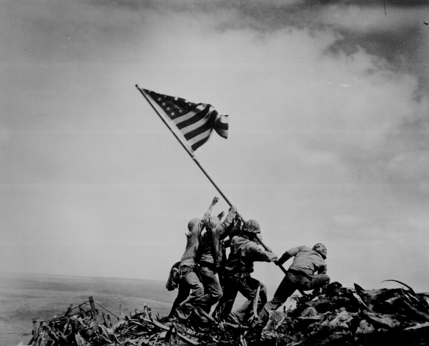
The
image became, among other things, a way to sell war bonds, a postage stamp, and
a bronze memorial in Washington, DC. It also inspired this photo by
Thomas Franklin of firemen at Ground Zero, which also became an iconic image of
9/11:

Choose
one of the iconic photographs below to research (or find your own):
–
Kevin Carter - Vulture Stalking a Child
--
Richard Drew – The Falling Man
--
Huynh Cong Ut – Napalm Strike
--
Dorothea Lange - Migrant Mother
--John
Filo - Kent State Massacre
--
Mike Wells - Famine in Karamoja
--
Lewis Hine - Breaker Boys
--
Photographer Unknown - 1968 Olympics Black Power salute
--
Edmund Hillary - Tenzing on Summit
--
Françoise Demulder - Palestinian Woman Pleads with Soldier
--
Alfred Eisenstaedt - V-J Day
--
Eddie Adams - Execution of a Viet Cong Guerrilla
--
Malcolm Browne - Burning Monk
--
Stuart Franklin -- Tank Man of Tiananmen Square
--
Photographer Unknown -- Hooded Man in Abu Ghraib
After
conducting some research, post a link to the
photo, along with the photographer's name (if known), and answer the
following questions:
What
year was it taken?
What
event was it depicting?
How
did people react to its publication?
How
does the photographer feel about capturing the image/ sharing it with the
public?
Why
do you think this image has become iconic?
Shooting Project #3
PHD101
Introduction to Photography
& Design
Shooting Project#3: Street Photography
Due Week 6, during
midterm (after some in-class shooting time)
Part I: Street Portraits
Breaking the Ice: Photojournalists must engage, on a daily basis, with
people they’ve never met before and feel comfortable photographing them and
asking them questions. Although
many of their subjects are doing “newsworthy” things and may be accustomed to
media attention, others are average citizens.
Assignment Objectives: This assignment has multiple objectives:
·
Create portraits that convey a subject’s personality
·
Think more about visual
communication and how to reveal something about your subject using
photographic language (light, composition, symbolic elements in the frame).
·
Collect basic caption information from
at least one subject – who, what, when, where, why (5 Ws)
·
Confront the fear of photographing strangers and dealing with possible
rejection!
For Part I of this
assignment,
find and approach at least 5 people
you’ve never met before, explain who you are and what you’re doing, and ask to
photograph them. Make multiple
portraits of each of your subjects, using the environment, quality of light,
and your perspective on the subject to convey something about them.
You
may want to choose a unifying theme
for your portraits such as city workers or dog owners. This isn’t necessary, but could give
you an interesting essay and a good opening line to approach your subjects
(“I’m doing a project on dog owners…”).
Collect caption information covering
the 5 Ws by posing some basic
questions to your subject. You may
choose to ask them about a current event or something specific to the
environment in which you find them.
You will write one caption for the subject of your choice.
Tips:
·
Wear your student ID
·
approach with a partner
·
explain your intentions
·
look for receptive and friendly subjects
·
look for subjects working in public or interacting with the public
·
find one business or location and stay there
·
offer to email a portrait to your subject
·
compliment your subject, make eye contact and smile
·
take some time to converse with and engage your subject before taking
out your camera
Part II: Street Scenes
Instead
of approaching subjects as you did in Part I, become a silent observer and look
for interesting moments of honest
emotion and interaction
(components of all strong photojournalistic images). Shoot at least 50
photos of street scenes with
human interest. Watch more clips
from “Everybody Street” to inspire you, or check out the work on http://www.street-photographers.com/.
Some
street photographers are confrontational, some are quiet, some find a spot and
wait for the moment to come to them, and others go hunting around a location,
never staying still. Shoot in the
style that feels most comfortable and genuine to you.
Tips:
·
Don’t try to be too sneaky – if someone catches you looking, smile,
make eye contact, and look non-threatening
·
Don’t be timid
·
Carry your camera as much as possible over the course of the week
·
Carry your camera at your side and raise it up only when you’re ready
to shoot
·
Scout locations where there are a lot of people interacting
·
Get your camera set for the light before your start shooting
·
Don’t go too far beyond your comfort zone and stay observant of your
surroundings (bring a friend or partner if it makes you feel more at ease)
·
When photographing kids, ask first if their parents are around
·
Go to an event, festival, or tourist attraction where lots of people
are out with their cameras
Week 6: We will process these images during our timed midterm Week 6.
We’ll go out for the first hour of next week’s class to complete
shooting for the project, then return to class to take the midterm. You may shoot as much of the project as
you’d like for homework, but none of the submission workflow should be
performed before class.
This
time, you’ll submit a contact sheet of 75-100 photos (Part I & II
combined). You’ll choose your 5 best street portraits and 5 best street scenes to resize, rename,
add metadata to, and submit for critique.
For one street portrait, you’ll also be required to add the 5 Ws to your
caption field in your metadata.
Grading
All
shooting projects are worth 50 points and are graded according to the following
criteria:
· Image
management (following
assignment specifications outlined during lab period)
· Creativity
of approach to concept
(effort and thought demonstrated)
· Visual
impact (use of
photographic seeing, basic mastery of technique)
In addition, part of the grade for the midterm will be
based on the correct import/export workflow completed within the time frame.
Sunday, January 27, 2013
Shooting Project #2: Place
PHD101
Introduction to Photography
& Design
Shooting Project#2: Place
Due Week 5, after Lab
period
Many
types of photographers strive to capture and convey a sense of place: editorial
travel photographers, commercial photographers shooting architecture and
interiors, fine art photographers who focus on the classic beauty of a
landscape, or those who create conceptual projects around our use (or abuse) of
the environment.
What is "sense of place" and how is it conveyed photographically? To show sense of place is to capture the unique aspects of a place, its culture and its character, through composition, quality of light, and the choice of whether to include the human presence.
What is "sense of place" and how is it conveyed photographically? To show sense of place is to capture the unique aspects of a place, its culture and its character, through composition, quality of light, and the choice of whether to include the human presence.
Conduct
some research into other photographers’ techniques for conveying a sense of place, and look at one
photographer more in-depth for your blog
commentary #2.
Based
on your own professional or personal interest, determine which photographic
approach appeals to you in conveying a sense of place. During the course of the week, set out
to make at least 50 images capturing
a sense of any one place you choose (inside or outside, restaurant, building,
neighborhood, home, natural space, industrial space, etc.).
Work
on moving beyond the literal and making the familiar new through the way you photograph it. Try to capture different perspectives
and convey your mood and feeling about the place through the way you use
composition and light.
Requirements
·
These images must be shot specifically for this assignment and
previously shot photographs will not be accepted. Make sure your date/time function in your camera menu
is set properly.
·
Shoot in the exposure mode that’s comfortable to you and will yield the
best results. If you’re not
comfortable shooting manually, use the program mode to get proper exposure.
·
Take care to avoid camera shake by shooting in brighter natural light
so that slow shutter speeds aren’t necessary (or use a tripod in low light if
you know how to do so)
·
Shoot in RAW + high fine jpeg
·
Use only available light – no flash
Submission standards
In
class, we’ll review the Lightroom import/export workflow we performed for
project one. You’ll choose 5 - 10 images from the 50 that best
convey sense of place and work well together to create a mini photo essay on your place. Process & organize them through LR, and remember the
following parameters:
·
Add contact info, copyright, and keywords to the IPTC metadata of all
images
·
Resize to 150 ppi, 10” for the longest dimension
·
Rename as LastName_ProjectName_sequence#
·
File Format = jpeg
·
Color Space = Adobe RGB
·
Output Sharpening = Screen
In
addition to the 5 – 10 selected images,
submit a contact sheet of at least 50
images shot for the project (following submission instructions given in
class).
Grading
All
shooting projects are worth 50 points and are graded according to the following
criteria:
· Image
management (following
assignment specifications outlined during lab period)
· Creativity
of approach to concept
(effort and thought demonstrated)
· Visual
impact (use of
photographic seeing, basic mastery of technique)
Subscribe to:
Posts (Atom)